A successful product launch depends not only on the product itself but also on how it is presented. The right cardboard display shape can improve product visibility, attract shopper attention, and make better use of retail space. Whether you choose a floor display, countertop display, or a custom design, selecting the right structure helps maximize the impact of your new product launch.

The foundation of any successful retail display begins with an honest assessment of your product. Before selecting a shape, you must bridge the gap between your product's physical realities and its marketing objectives. A display that works for high-end electronics will fail significantly if tasked with holding heavy-duty industrial components.
To effectively define your product profile and display needs, consider the following critical dimensions:
The physical nature of your product dictates the structural integrity required of the cardboard display.
Load-Bearing Capacity: If your product is heavy (e.g., hardware components or bulk goods), you need a rigid, box-style display with reinforced base structures. Lightweight items, such as snacks or small accessories, offer more flexibility for intricate, die-cut designs.
Dimensions and Footprint: Consider how your product is packaged. Does it require shelf space, or does it hang? A tall, narrow silhouette works well for long items, while a deep, tiered structure is better suited for products that need to be stacked.
How do you want customers to engage with the product?
The "Grab-and-Go" Experience: For fast-moving consumer goods, open-access tray displays are ideal. They reduce the friction between the shopper and the product, allowing for quick selection.
The "Consideration" Experience: If your product requires reading labels or understanding technical specs, your display needs "viewing real estate"—angled shelves or flat panels that allow for branding and information-heavy content.
The shape of your display should be a reflection of your supply chain cadence.
High-Volume Turnover: If you are moving a high volume of units, a "dump bin" or a large-capacity pallet display is often the most efficient shape. It minimizes the time floor staff spend replenishing stock.
Curated Selection: For premium launches, a smaller, highly structured display (such as a countertop unit) keeps the product organized and prevents the "messy shelf" look that can devalue high-end merchandise.
What is the single most important feature of your product?
Visual Impact: If the packaging design is the main selling point, opt for a display with a large, unobstructed "header card" or a full-panel graphic wrap.
Utility: If the product’s function is the key, the shape should be engineered to allow the customer to handle a "dummy" unit or see the component clearly through a die-cut window.
Pro-tip for Industrial Products:
Keep it simple. Avoid excessive ornamentation; focus on stability and accessibility. Professional, geometric displays highlight technical specs and build immediate trust with industrial buyers.
Here is the English version, written with a more natural, conversational tone that avoids the rigid, repetitive "AI-list" structure.
At the end of the day, your display’s shape isn’t just a design choice—it’s a response to the retail environment. No matter how sleek your design looks on a screen, it will fail if it clashes with the store’s layout or gets in the way of shopper traffic. Before you finalize a shape, stop looking at the cardboard and start looking at where your product is actually going to live.
If you’re placing your display in a high-traffic industrial supply aisle, forget about being "artsy." The only thing that matters here is stability. A classic, square, or rectangular floor-standing unit is the gold standard for a reason: it’s bottom-heavy and sturdy. Even if a forklift or a shopping cart brushes past it, it won’t tip over. It doesn’t need to shout for attention; its strength lies in being a reliable "silent salesman" that guides customers without turning the aisle into an obstacle course.
End-caps are prime real estate, but shoppers usually breeze past them. Your goal is to force a "visual speed bump" that makes them stop in their tracks. Ditch the generic boxes and go for tapered or tiered structures that bring your product right up to the shopper’s eye level. Remember, an end-cap is visible from multiple angles, so keep at least three sides accessible. You want that "frictionless" interaction where a shopper can grab your product without having to step out of the main walkway.
Counter space is expensive, so your display needs to work in a tiny footprint. If you’re selling small hardware or accessories, skip the bulky stands and go for compact tiered steps or a rotating rack. Don’t try to show your entire catalog; here, the goal is impulse. Keep the layout tight and organized. When a customer is standing there waiting to pay, a well-placed, accessible accessory is almost impossible to ignore.
When you’re in a wholesale or warehouse setting, your display basically acts as temporary shelving. Forget about complex silhouettes—think heavy-duty, open-top pallet displays. You want a design that stacks and tiles like Lego bricks, fitting perfectly side-by-side without wasting a single inch of floor space. In a warehouse, the shape that maximizes your "shelf impact per square foot" is always the winner.
A quick "Pro-tip" before you commit:Do a "crouch test" before you sign off on the design. Industrial buyers are busy professionals—if your display forces them to squat down or reach awkwardly for heavy parts, they’ll just keep walking. Keep your core products within the "elbow-to-shoulder" zone (roughly 30 to 60 inches off the floor). That’s the sweet spot for professional buyers, and hitting it shows you actually understand their workflow.
Think of your display's shape as a silent traffic controller. Often, shoppers aren't drawn to the product itself initially; they are pulled in by the "posture" of the display. If your display looks like a rigid, uninviting block, shoppers will just glance and keep moving. But if the geometry is intentional, it forces them to slow down, pause, and eventually, reach out.
Shoppers move through a store with momentum. A display with curved edges or chamfered corners acts as a natural guide, gently pulling them off the main aisle and into your brand's orbit. On the other hand, stark, aggressive angles set up in a corner act like a "hard stop."
While this kind of visual disruption can be great for triggering impulse buys, it can backfire if your product requires research. You don’t want to frustrate a buyer; you want to invite them into a space where they feel comfortable lingering.
When a customer decides they want to touch your product, the display's shape dictates whether that interaction actually happens. A towering, imposing structure creates a psychological barrier—it signals that the product is "off-limits" or overly premium. Conversely, an open-tray design with a slight forward tilt lowers that barrier.
It subconsciously tells the shopper, "This is accessible; go ahead and pick it up." That subtle shift in geometry is often the thin line between a casual look and a serious consideration.
A common mistake in industrial marketing is trying to cram too many SKUs into one display, resulting in a chaotic "clutter-bin" shape. This creates visual noise that makes the shopper’s brain switch off before they even get close.
Instead, let the shape serve a single "Hero Product." Use a wrap-around structure that compresses the surrounding space, forcing the eye to settle exactly where you want it. The cleaner your geometry, the more efficient the interaction.
A well-designed shape shouldn't just hold your product; it should create a clear, elegant path for the shopper's eye to travel from the display edge directly to the hardware.
The tension between "looking good" and "holding up" is the eternal tug-of-war in cardboard engineering. In the world of industrial displays, a stunning design that collapses under the weight of your parts is a disaster, while a rock-solid display that looks like an ugly, oversized shipping box won't do your brand any favors. You need a marriage of form and function where the structural elements themselves become part of the aesthetic.
Stop trying to hide the structural support behind layers of thin, flimsy cardboard. Instead, turn the reinforcement into a design element. If you need to support heavy hardware, use cross-braced internal walls or honeycomb board structures that are visible.
When done right, these geometric patterns signal strength and industrial precision to the buyer. It stops being "just a box" and starts looking like a piece of industrial equipment itself—which is exactly the vibe you want for B2B.
Aesthetic appeal isn't just about the printed graphics; it’s about the "feel" of the material. Thin, lightweight fluting is great for cost-cutting, but it looks cheap and creates a "dented" aesthetic when loaded with heavy components.
For industrial displays, opting for heavier, double-wall corrugated cardboard changes the entire profile. It provides a crisp, sharp edge that creates clean lines and flat surfaces, which makes your branding look professional and high-end. The sturdiness of the material actually elevates the perceived quality of the product inside.
Don’t rely on glue and tape to fix a bad shape. Stability should be built into the geometry of the design. A wide, low-center-of-gravity silhouette allows you to push the aesthetic boundaries—like adding elaborate headers or angled displays—without compromising the load-bearing integrity.
By using interlocking tabs and friction-fit slots rather than just relying on adhesives, you create a structure that feels solid to the touch. When a customer interacts with your display, the lack of "wobble" translates directly into trust in your product's reliability.
In retail, every square inch of space is an overhead cost. The geometry of your display is the primary lever you have to either waste expensive floor real estate or squeeze every drop of profit out of your footprint. Your ROI isn't just a function of volume; it's a measure of how efficiently you pack high-converting inventory into a target zone.
The following table breaks down how different display geometries directly impact your retail performance metrics:
| Display Shape | Primary ROI Driver | Best Retail Location | Space Efficiency |
| Tall/Tiered FSDU | High SKU density | High-traffic main aisles | Excellent |
| Rotating Countertop | High impulse conversion | Checkout counters / POS | High |
| Corner/L-Shaped | Reclaiming "dead" space | Store corners / Pillars | Maximum |
| Modular Pallet Trays | Bulk volume / Lower labor | Warehouse clubs | Very High |
| Simple Box/Dump Bin | Quick replenishment | Discount/Clearance zones | Moderate |
Stop obsessing over square footage and start maximizing "vertical throughput." If your floor space is limited, abandon the low-profile, spread-out designs that eat up aisle space. Shift to tall, tiered structures with integrated headers. This verticality lets you double your SKU density without paying for extra rent, all while positioning your product right at the shopper’s eye level.
Nothing kills an ROI calculation faster than "dead air" on a shelf. If your display shape doesn’t account for the standard retail grid, you are effectively leaving money on the table. You need a "Tetris" approach: modular, interlocking shapes that fit seamlessly into store fixtures. When your displays can tile perfectly side-by-side or nest into retail corners, you maximize stock density and create that "full-to-the-brim" aesthetic that signals a high-demand product.
Most retail environments are littered with "dead corners" that everyone ignores. Don't let that space sit idle. Use specifically engineered L-shaped or wraparound structures to reclaim those neglected zones. By adapting your shape to the store's architecture, you’re essentially acquiring free real estate—turning non-performing corners into high-exposure showcases that add incremental profit to your campaign.
A cardboard display isn’t just a structural box; it’s the most tangible expression of your brand’s personality in a retail environment. When a customer walks down an aisle, they should recognize your product before they even read the logo. If your brand is synonymous with industrial precision or premium reliability, a cheap-looking, poorly printed display will create a cognitive dissonance that kills your conversion rate.
Your display’s silhouette should echo your brand’s visual vocabulary. Think of it as an extension of your packaging:
Minimalist & Industrial: If your brand favors clean lines and technical excellence, your display shape should follow suit with sharp, geometric, and uncluttered profiles. Avoid unnecessary "frills" or complex die-cuts that clutter the design.
Dynamic & Disruptive: If your brand voice is bold and innovative, your display should break the mold. Use asymmetric shapes or unconventional heights to stand out against the monotonous rectangular grid of standard retail shelving.
The "geometry" of your display says as much about your brand as your color palette:
Stability = Reliability: For brands focused on technical durability (like mechanical connectors or electrical hardware), a wide, low-profile, and symmetrical shape communicates stability. It signals to the B2B buyer that your company is a serious, long-term partner.
Precision = Quality: If your product involves high-frequency cables or advanced components, the display must look "engineered." Tight tolerances, flush-fitting panels, and clean edges reflect the high manufacturing standards of the items inside.
Visual language is about more than just the logo—it’s about the repetition of a specific aesthetic. If your brand uses a specific color scheme (e.g., JMTJM’s blue and white), the display shape must be designed to maximize the "canvas" for that branding.
Avoid "Design Overload": Don’t sacrifice your brand’s visual integrity just to fit more product on the shelf. If the display is so packed with stock that your branding is obscured, you’ve lost the battle for brand awareness.
Strategic White Space: Even in a crowded retail environment, leave "visual breathing room" in your display design. A cleaner display stands out more effectively than one that is covered from top to bottom in small, unreadable text.
Selecting the right cardboard display isn't just about logistics—it’s a strategic decision that drives visibility, customer engagement, and ROI. Whether you need the rugged stability of an industrial floor unit or the space-saving precision of a countertop stand, your display shape should always mirror the quality of the product inside.
At WOWPopDisplay, we turn structural engineering into a powerful sales tool. We specialize in custom-designed retail solutions that combine high-impact branding with industrial-grade durability. Don't let your next product launch get lost in the shuffle.
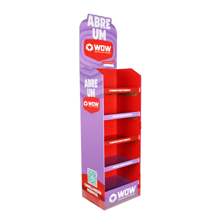
There is no single best shape, but tower displays, island displays, and end-cap displays are commonly used for launches. Tower displays are great for strong vertical branding, while island displays work well for 360° visibility in open retail spaces.
Shapes with strong visibility from multiple angles, such as island displays and free-standing units, tend to attract the most attention. Large graphic areas and unique structural shapes also help increase visibility.
Small products like cosmetics or snacks work well with tiered shelving or compact floor displays. Larger or heavier products usually need pallet-style or reinforced base structures for stability and space efficiency.
End-cap placement is not a shape itself but a location. However, it works very well with front-facing or bold structural displays, making it one of the most effective positions for new product launches.


3/F No. 6 Hedi Road, Gongming Street, Guangming District, Shenzhen City, GD, China, 518106