
A lot of store promotions fail for a simple reason: shoppers do not stop long enough to notice them.
The product may be good. The price may be competitive. The offer may even be strong. But if the message gets lost in the aisle, none of that helps much. This is where POP advertising matters most. It works at the point where shoppers are already looking, already comparing, and often only a few seconds away from making up their minds. In that sense, a POP display is not just a promotional extra. It is one of the most direct sales tools inside the store.
That is also why point-of-purchase displays still deserve serious attention from retailers, brand teams, and store planners. They do more than decorate the floor. They attract attention, explain products, guide movement, and help turn interest into action.
In a real store, shoppers do not read everything. They scan. They notice shapes, colors, prices, and product clusters. If something catches their eye, they move closer. If not, they keep walking.
That is why POP advertising works so well in retail. It appears right next to the product and speaks at the exact moment when people are deciding whether to stop, compare, or buy. It is close-range, immediate, and highly practical. In many ways, it does the job that ordinary advertising cannot do once the shopper is already inside the store.
A strong Retail POP display helps answer the questions shoppers ask without always saying them out loud: What is this? Is it on promotion? Why should I care? Where do I find it? Is this worth buying?
Those are not small questions. They are usually the difference between “maybe later” and “I’ll take one.”
One common mistake is treating POP as nothing more than discount communication. Price signs matter, of course, but good POP advertising does more than announce a lower price.
It can bring shoppers into the store, guide them to a section, support a promotion, clarify product benefits, and reinforce brand presence at shelf level. Different forms of POP serve different purposes, including storefront POP, in-store promotional POP, and directional POP. Together, they create a more complete selling environment.
That is really the point: a POP Display stand should not be viewed as a single-use graphic object. It is part of how the store communicates.
In a crowded retail environment, attention is limited. Products that are not highlighted often disappear into the shelf.
A POP display helps featured items stand out. It can support a new launch, a seasonal promotion, a value offer, or a high-traffic item designed to build store energy. When used well, it gives the shopper a reason to pause.
A shopper who has to guess too much usually walks away.
In-store POP can explain what the item is, what the promotion includes, where the product is located, and why it is worth noticing. Shelf tags, promotion cards, recommendation signs, and section-based displays all help reduce decision friction. The clearer the message, the easier the purchase path becomes.
POP advertising also affects how the store feels.
When displays are well placed and visually consistent, the store feels more active, more intentional, and easier to shop. When they are messy, repetitive, or disconnected, the opposite happens. Good POP helps create a stronger sales atmosphere and a more readable store environment.
One of the most useful ways to understand POP advertising is to look at the shopper’s mental path.
Usually, the process is pretty simple. First the shopper notices the display. Then comes a quick internal question: what is this? If the message is strong enough, they move closer. Then interest develops, followed by desire, then rational checking: brand, size, price, usefulness. If the answers hold up, the purchase happens. POP advertising plays a role at each of those steps by attracting attention first, building interest next, and then helping confirm value.
That is why POP Display design should never be treated as surface decoration. A display is not just there to look energetic. It is there to guide the shopper from seeing to considering to buying.
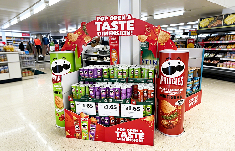
The Pringles display is a good example of how direct promotional POP works in a supermarket setting.
It is built around an easy read. Large brand visuals, bold red structure, oversized product graphics, and repeated price panels make the offer hard to miss. The cylindrical side elements echo the product packaging, which helps the display feel instantly recognizable. More importantly, the promotion is not buried. A shopper can understand the product type, the featured flavors, and the value message almost at a glance.
This is the kind of POP display example that shows why simple clarity still works. It does not rely on complicated storytelling. It relies on visibility, repetition, and a strong promotional frame. In a busy store, that is often exactly what is needed.
Not all POP does the same job, and that is worth remembering.
Storefront POP is usually the first thing shoppers see. It helps draw traffic inward and can make the store feel active before the customer even steps inside. In-store promotional POP works closer to the product and supports offers, sections, and category-level visibility. Directional POP helps shoppers move through the store and find what they need faster, whether that means product zones, checkout, service counters, or event areas.
This matters because retailers often use one type of message everywhere. That usually weakens the result. Different retail moments call for different POP functions.
A strong display is rarely complicated. It is usually clear.
First, it has one main message. Not five.
Second, it is easy to read from a reasonable distance.
Third, it supports the product instead of competing with it.
Fourth, it fits the location.
And fifth, it gives the shopper enough information to feel confident, but not so much that the display becomes heavy.
This is especially important for Custom POP displays. Custom work should not just look different. It should perform better because it solves a real store problem: low visibility, weak conversion, poor navigation, or limited shelf impact.
A lot of store POP fails because it asks too much of the shopper.
Sometimes there is too much copy. Sometimes the visuals are noisy. Sometimes the price is visible, but the reason to buy is missing. In other cases, the display looks fine on its own but does not work in the actual aisle because it is hard to notice, hard to understand, or badly placed.
Another problem is sameness. If every display says “special offer” in the same tone, shoppers stop reacting. The message becomes wallpaper.
That is why better point-of-purchase displays need more than bright colors. They need hierarchy, relevance, and real retail logic behind them.
Shoppers respond better when a display feels helpful, not just loud.
A good POP sign can point them to a category, clarify a value deal, explain what is different about a product, or make comparison easier. A good Retail POP display reduces uncertainty. That is a big deal in stores where people are making quick choices.
This is also why trust matters. For example, clearance or slow-moving products often sell better when the POP explains why the item is being marked down. That added context helps shoppers feel more comfortable taking action.
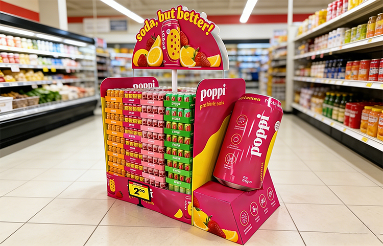
The Poppi display works differently from the Pringles example, and that contrast is useful.
Where the Pringles unit leans on price visibility and straightforward promotion, the Poppi installation is much more brand-led. The bright pink structure, oversized can graphic, stacked color-blocked product trays, and fruit imagery create a display that feels energetic before the shopper even reads the details. It is promotional, yes, but it also builds personality.
That makes it a strong example of how Custom POP displays can do more than push a deal. They can help a brand own a piece of space, create instant recognition, and make a category feel more exciting. As one of the stronger POP display examples, it shows how product visibility and brand mood can work together instead of competing with each other.
For store teams, the question is not whether POP matters. It does.
The better question is whether each display is doing a clear job. Is it pulling attention? Explaining an offer? Guiding movement? Supporting trust? Helping the shopper decide faster?
If the answer is vague, the display probably needs work.
The most effective POP Display stand is not necessarily the biggest or the loudest. It is the one that makes the shopper’s next step easier.
Final Thoughts
POP advertising still plays a very practical role in stores because it works close to the buying decision. It attracts attention, supports understanding, creates atmosphere, and helps turn product visibility into real sales. That is why a good POP display should never be treated as an afterthought.
The strongest point-of-purchase displays do something very simple, very well: they help shoppers notice what matters, understand it quickly, and feel ready to act.
And in retail, that kind of clarity is worth a lot.


3/F No. 6 Hedi Road, Gongming Street, Guangming District, Shenzhen City, GD, China, 518106


